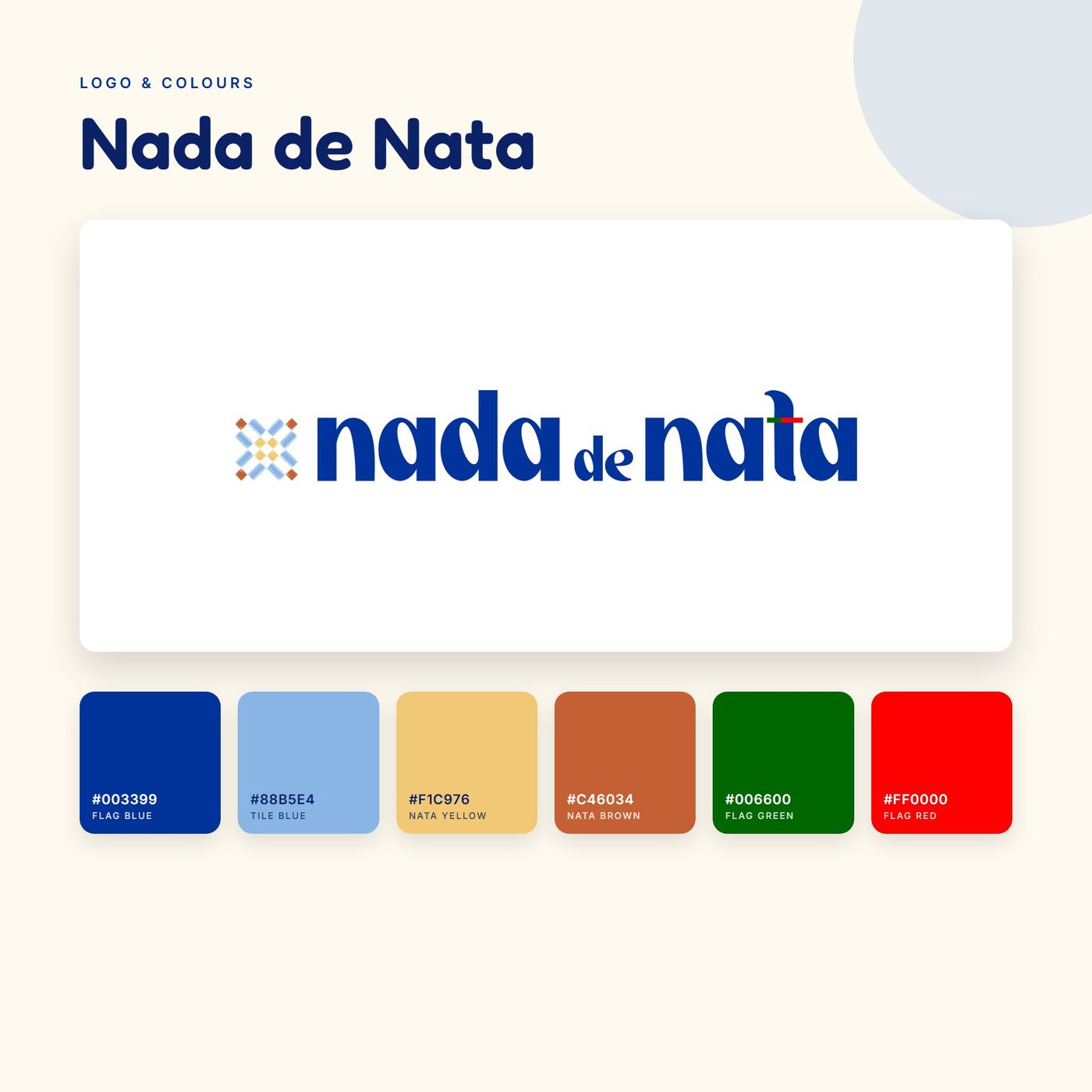
Logo & colours
A bold blue wordmark with a small tile icon, and a palette taken from Portuguese tiles, the flag and the tart itself.

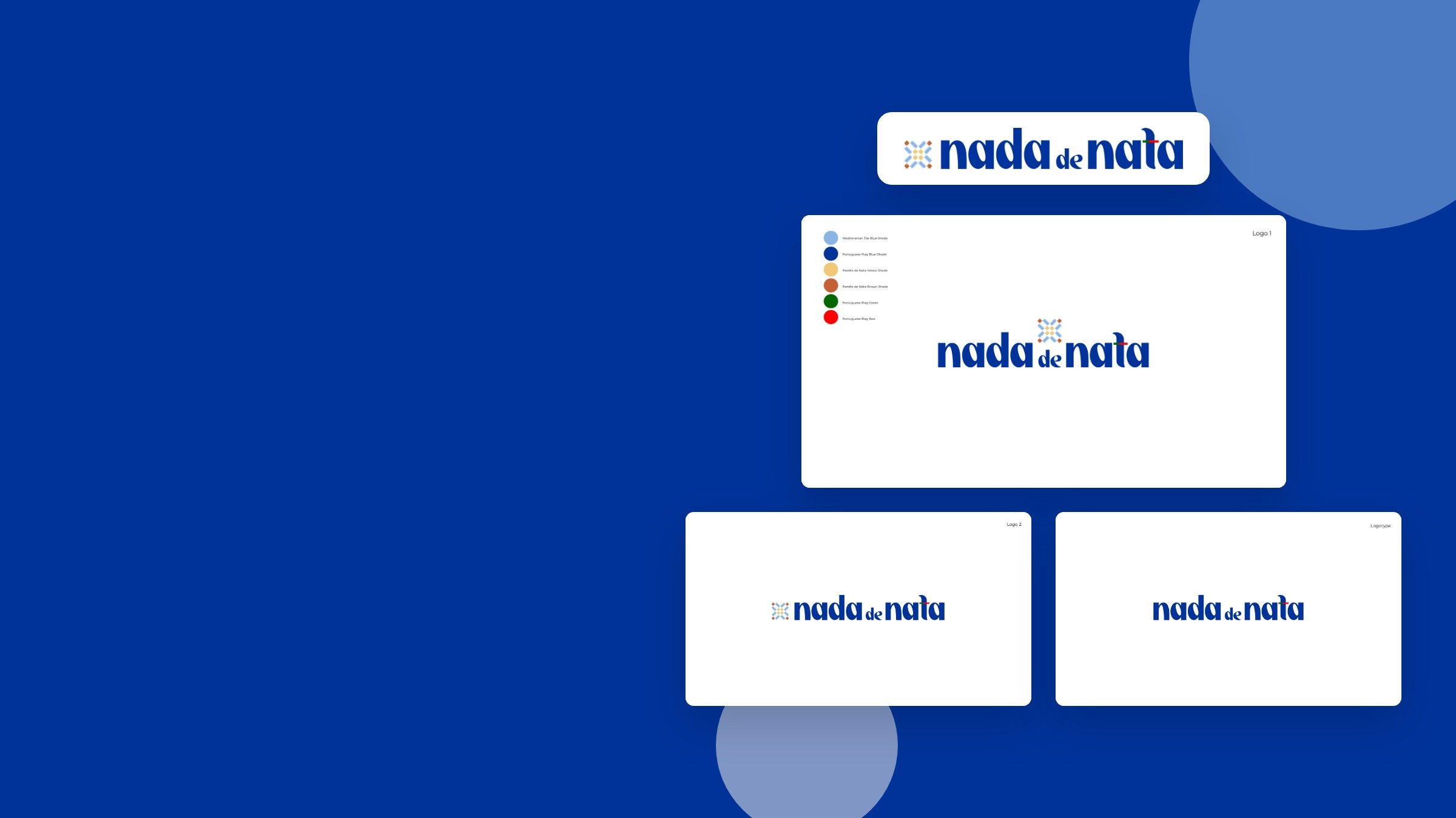
Brand Identity · Graphic Design
Services used
Team Knocknock × Nada de Nata
Nada de Nata is one of Arvalava’s food brands, serving pastéis de nata at the International Food Festival. We created its logo and colours, its logo guideline, a tile pattern and the stall tablecloth. It belongs to the same family as Ottomańska Pokusa, whose brand we also built.
What we did
A bold blue wordmark with a small tile icon, and a palette taken from Portuguese tiles, the flag and the tart itself.
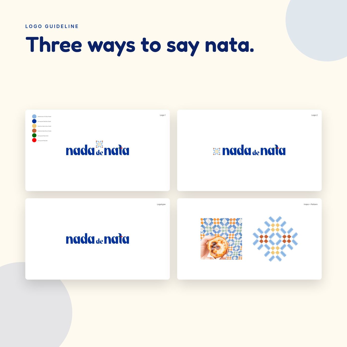
Two logo versions and a logotype, the six-colour palette, and the tiles that inspired the pattern.
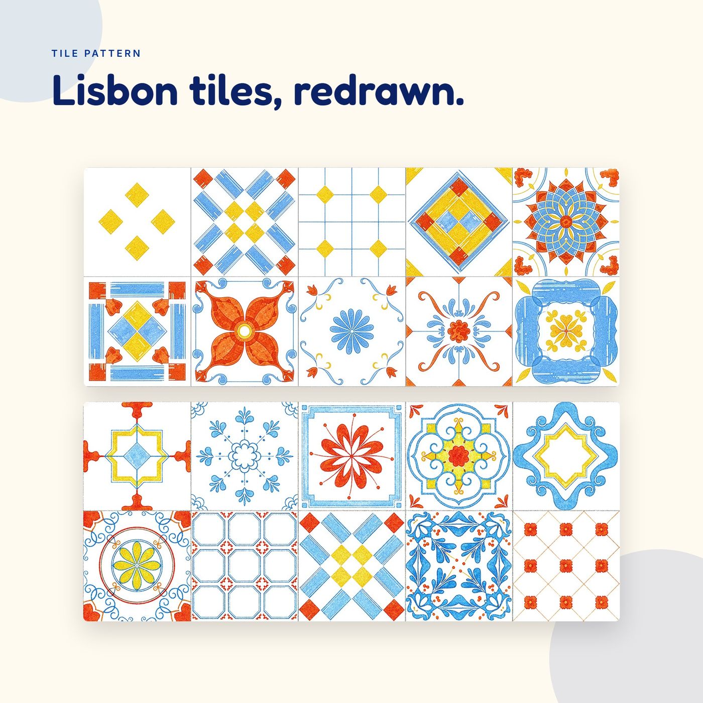
A set of tiles in the brand blues, yellow and red, made to repeat on packaging and the stall.
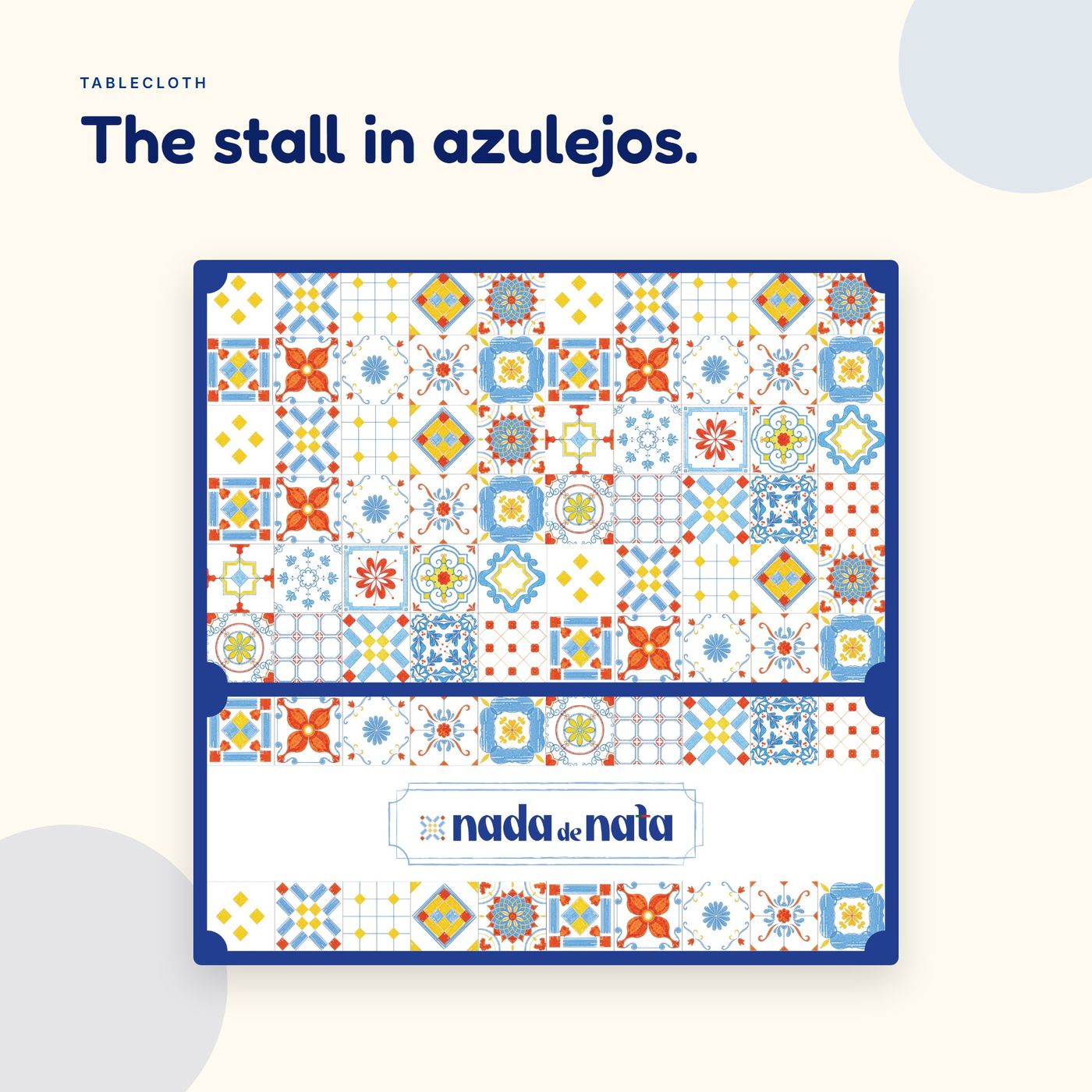
A 150 × 150 cm tablecloth that covers the stall in the tile pattern, with the logo on the front.
Logo, colours and stall materials from one team, ready for festivals and the high street.